Visualising deadlines 📅
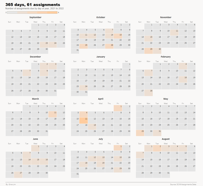
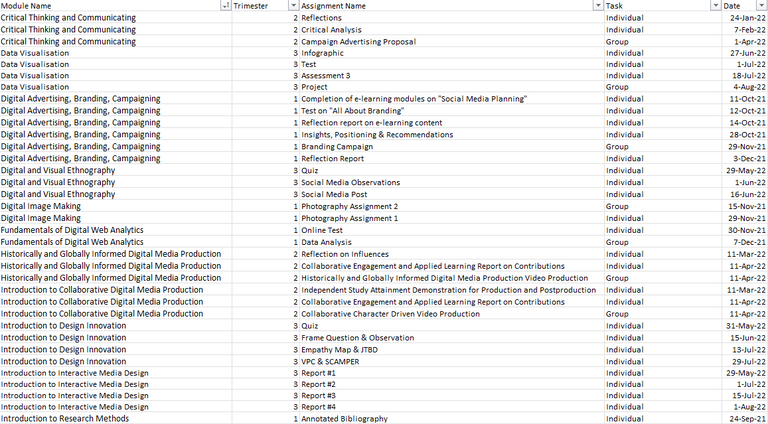
This data story was done as a personal project during school break for incoming freshmen. The visualisation shows the assignment deadlines for a freshman in the DCIM programme at SIT over the course of a year from 2021 to 2022. Source was from assignment briefs provided by lecturers.
Final Design


I chose to use a simple colour scheme for easier readability. The darkness/lightness of colour represents the assignments due (the darker the colour, the greater the number of assignments due).

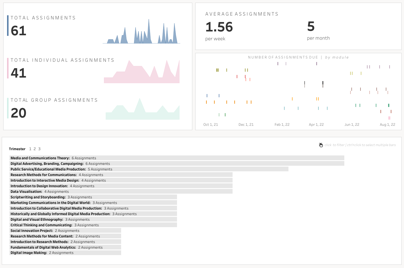
Taking it a step further, I decided to add an interactive dashboard where incoming freshmen would be able to filter assignments by trimesters or by individual and group assignments.

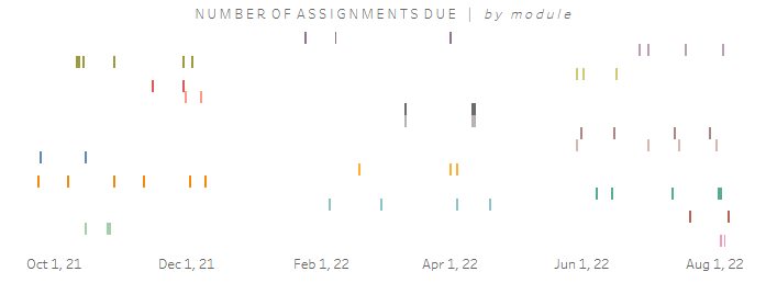
The responsive gantt chart makes it easy to visualise the workload and allow freshmen to plan work around deadlines and allocate resources more efficiently.
Process
Check out my Tableau Public profile.

